✦ Kimi Takemura ✦
竹村
+ info
+ CONTACT
+ index
+ notes
+ shop
+ 2026 sketchbook
+ 2025 sketchbook
+ 2024 sketchbook-1
+ 2024 sketchbook-2
+ 2023 sketchbook
+ 2022 sketchbook
+ 2021 sketchbook
+ 2020 sketchbook
+ 2019 sketchbook
+ 2018 sketchbook
+ 2017 sketchbook
+ 2016 sketchbook
+ 2015 sketchbook
+ 2014 sketchbook
+ 2013 sketchbook
+ 2012 sketchbook
+ 2011 sketchbook
+ 2010 sketchbook
+ client projects
+ vectorkits
+ apparel
+ microsoft Learn
+ Microsoft Azure
+ Amazon web services
+
fractaled
visions
logo redesign / refresh / typography
+
Project scope
design a refreshed logo for a friends vj and events work. an informal design project.
[link] fractaled visions
+
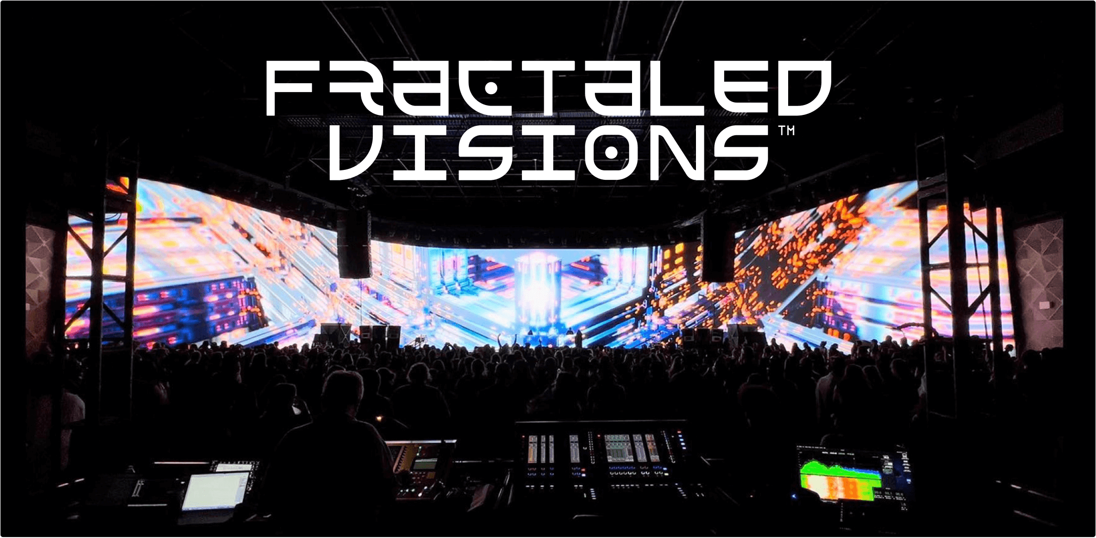
about the brand
visuals for an array of functions, spanning headliner musicians, large scale events and advertising.
+
use cases
Logo has to read well small, or small and on complicated backgrounds.
logo should stand out on event flyers or online promotion with many artists.
+
Project direction
bluesky, and after some initial designs, a request to have it feel similar in spirit to the first logo but updated.
output:
vector file containing clean logo.
+
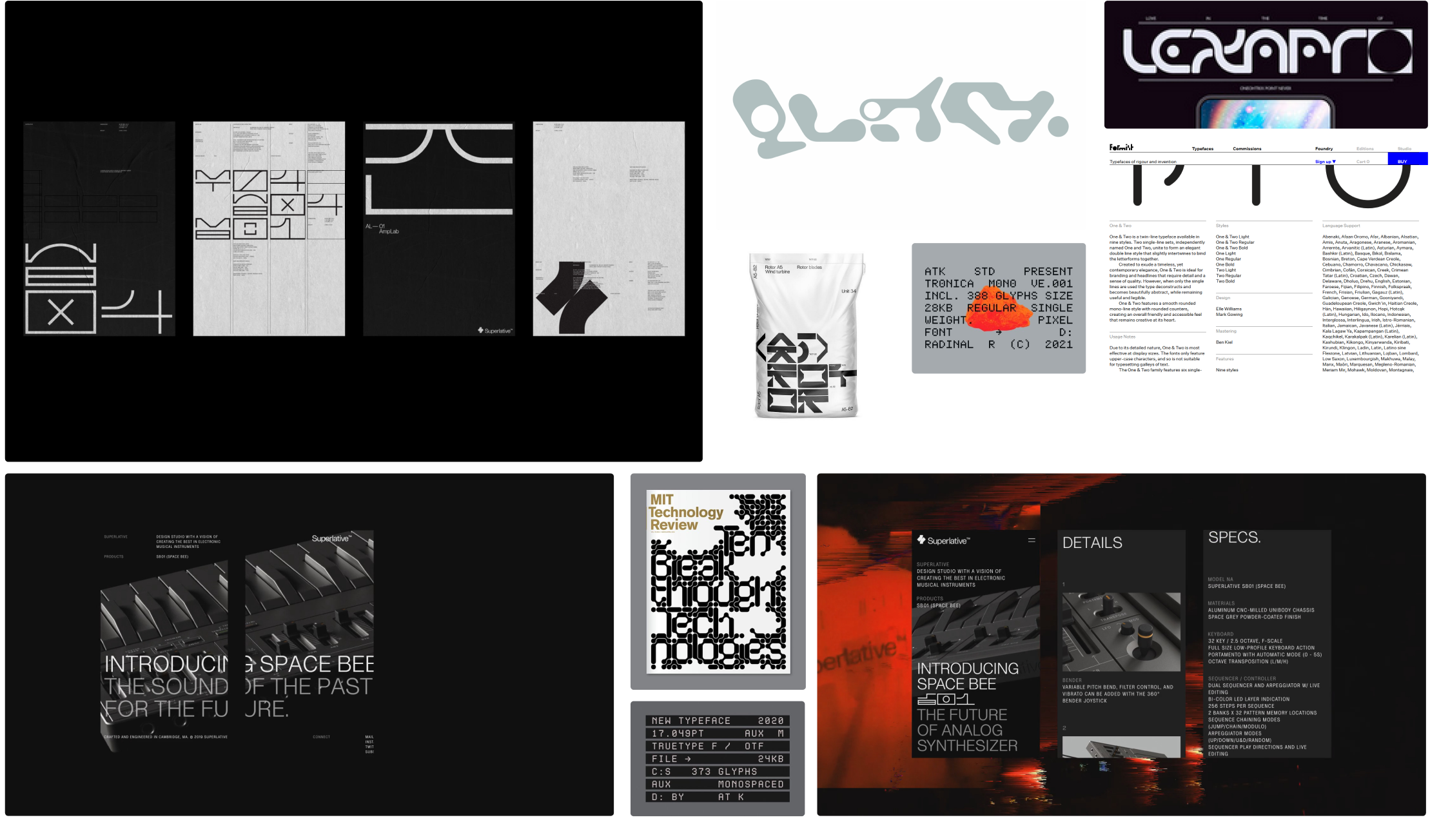
reference / design mood board
tech, minimalist, grid-based, graphical
+
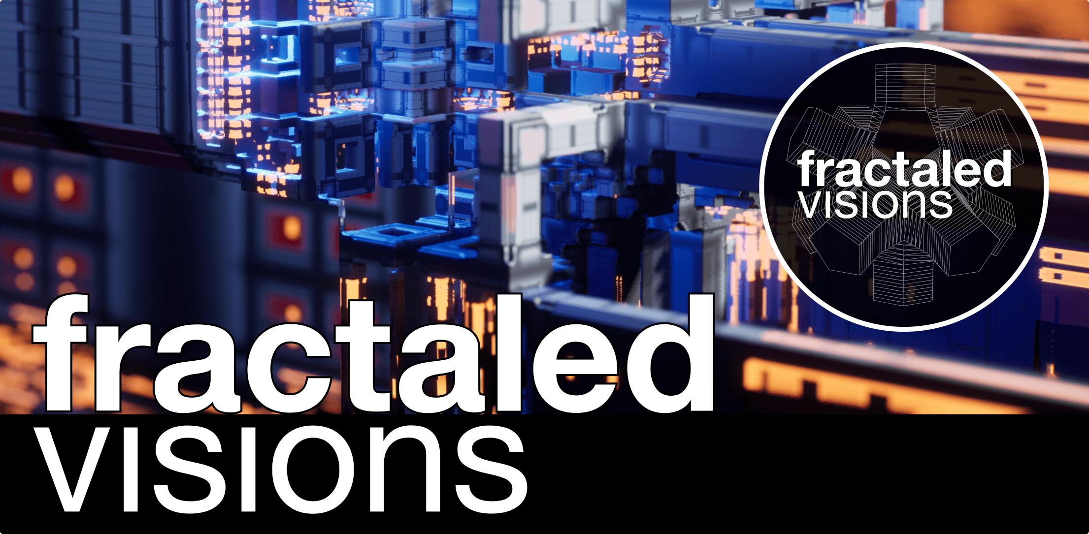
reference art from fractaled visions


+
initial logo

+
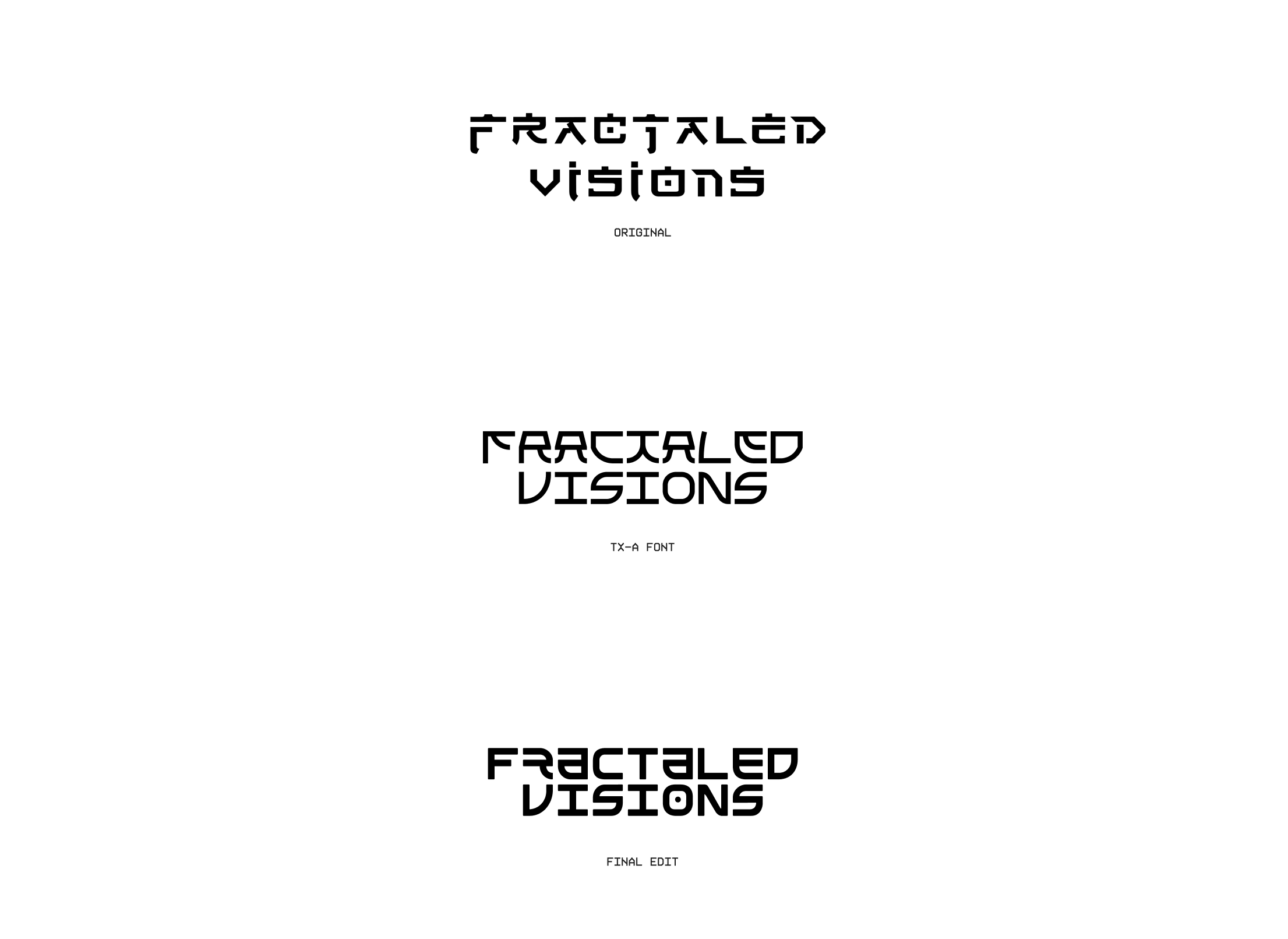
workflow
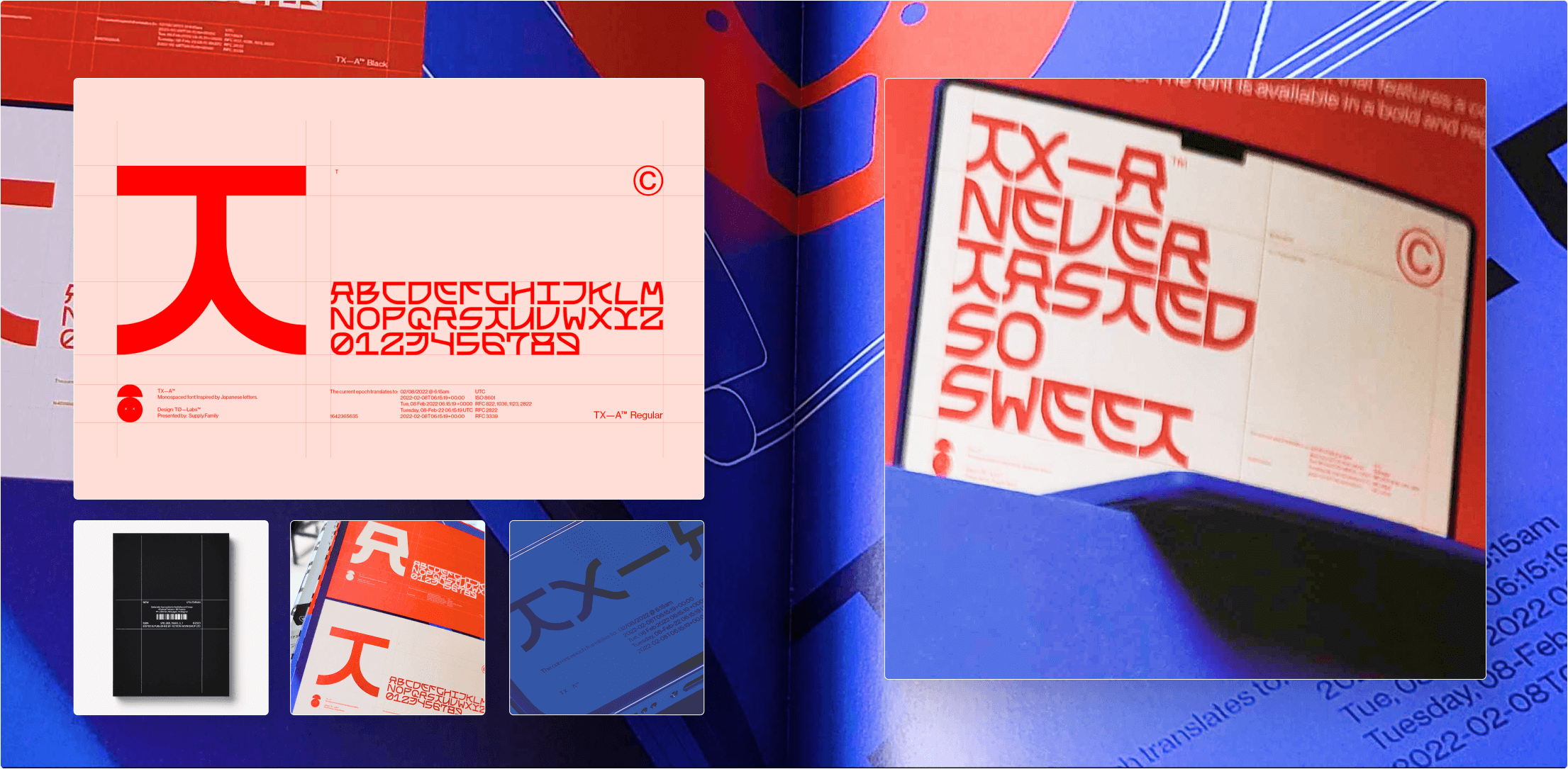
I was looking for a blocky, asian-influenced typeface to start off from, and found font ‘tx-a’, built by [studio name].
it’s a good mix of blocky and curved shapes in an oriental style.The font was available for license.
the book that had the font was called ‘New Utilitarian’ by victionary.
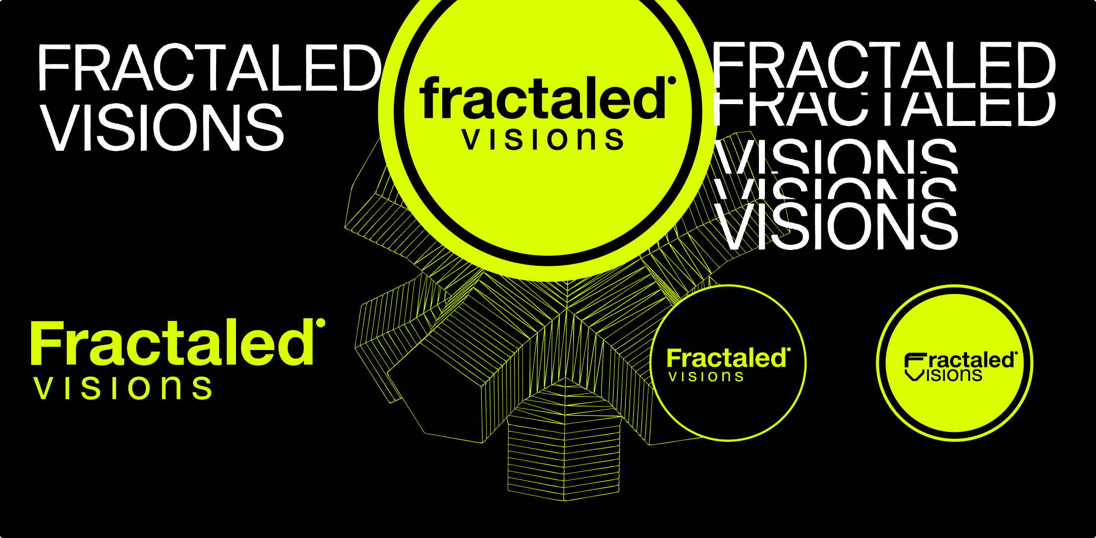
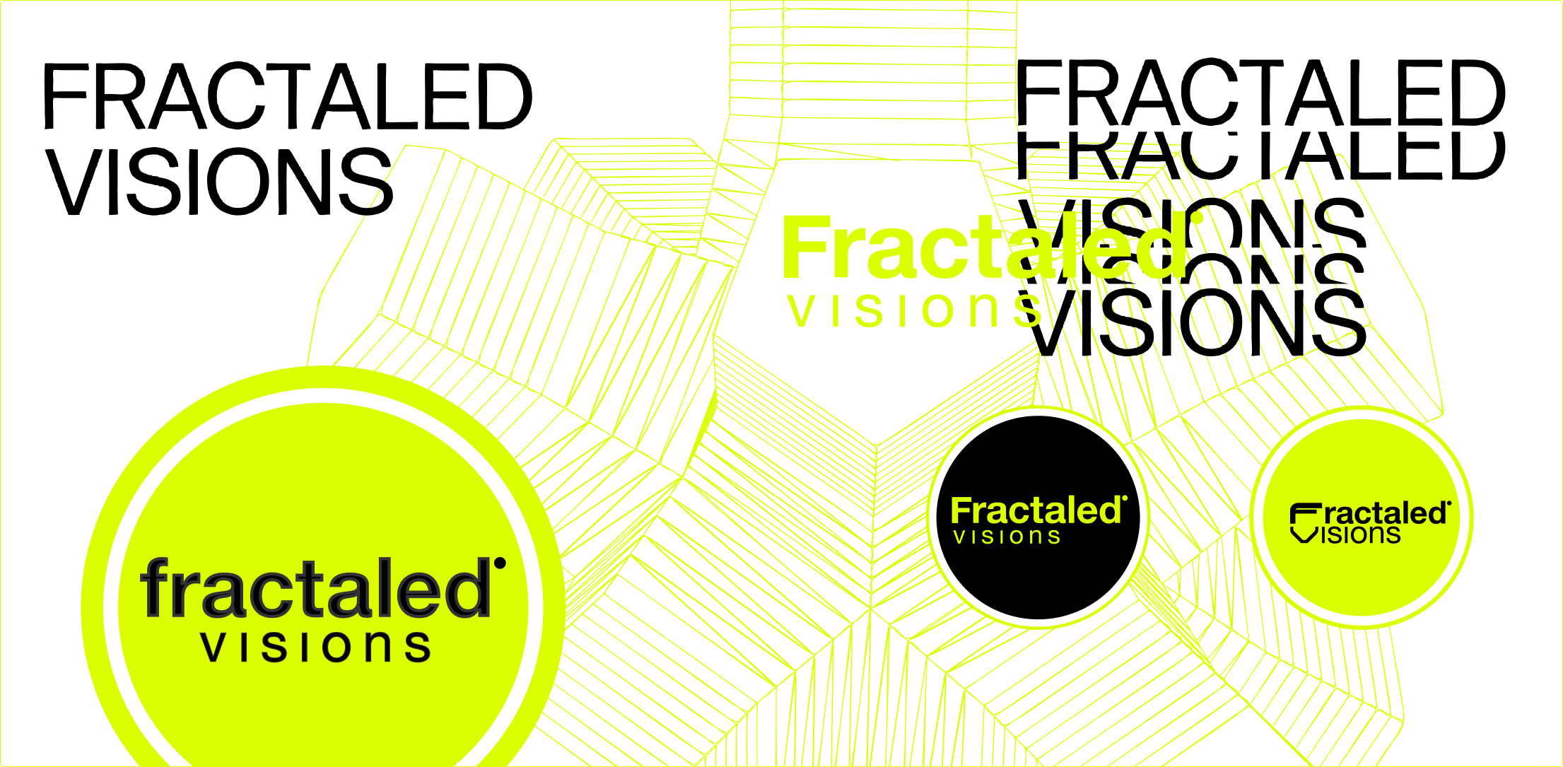
+
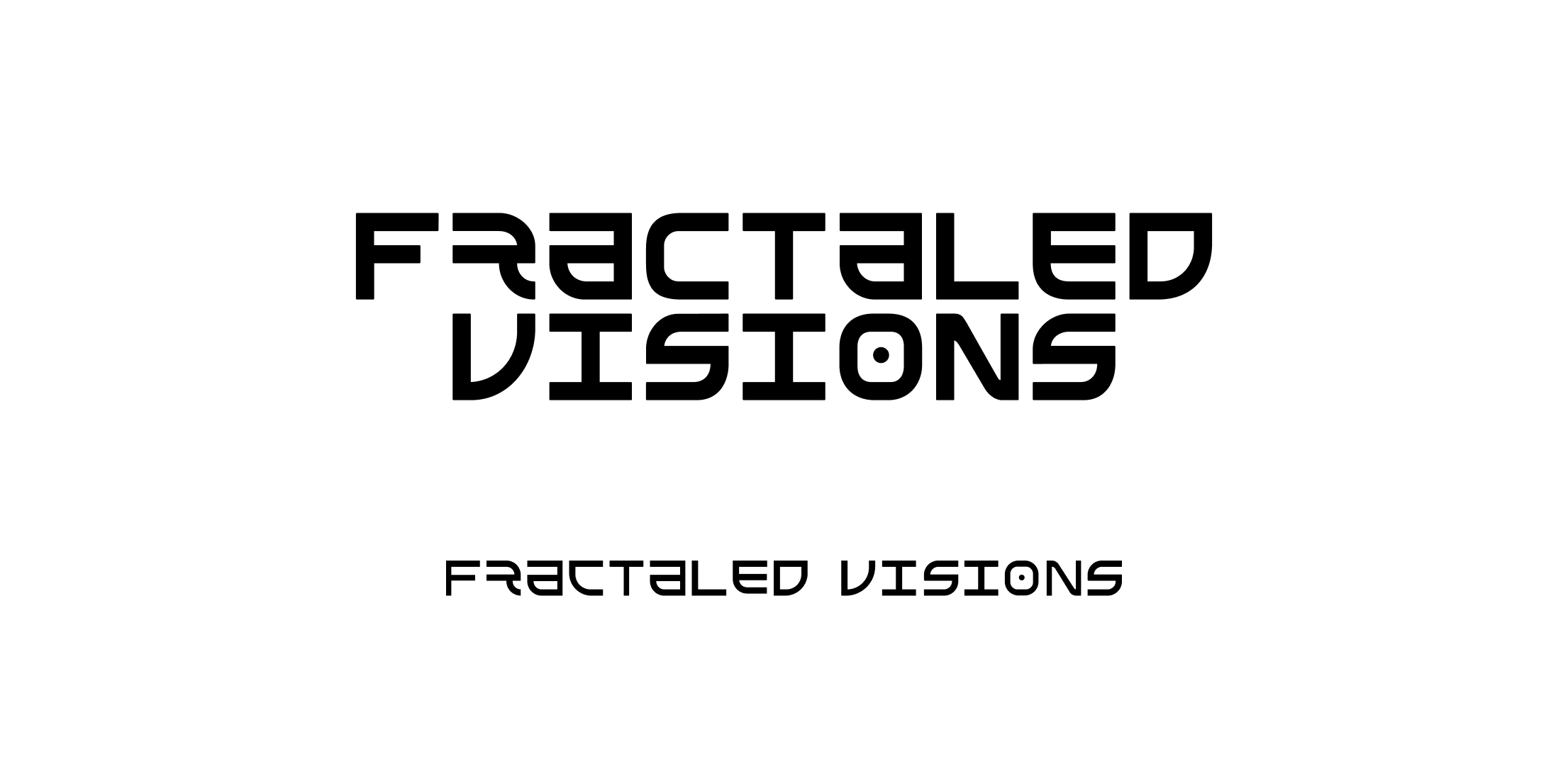
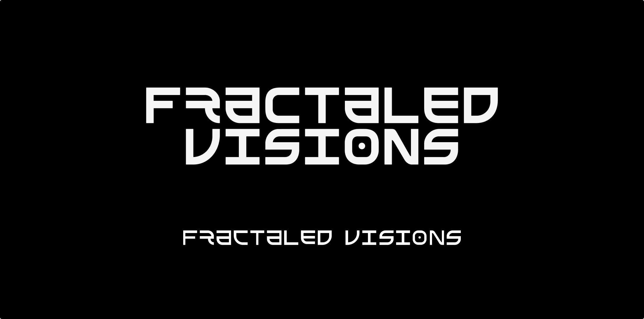
final logo
dark / light/ wide
+
process
two references, the original logo and the tx-a font were pieced together. Simplified some of the letters for reading flow, and thickened the lines so it would read well small, on a crowded event poster.
+
exploration sketches